

In an era where data streams endlessly from every corner of our digital world, the challenge isn’t just collecting information-it’s making sense of it. Enter artificial intelligence, a transformative force reshaping how we interpret complex datasets. Imagine turning raw numbers into compelling visual stories that speak louder than spreadsheets ever could. This article explores how AI empowers us to transform data into insightful, easy-to-understand visual reports, bridging the gap between information overload and clear, actionable knowledge. Whether you’re a seasoned analyst or a curious newcomer, discover the tools and techniques that bring data to life through intelligent design.
Table of Contents
- How AI Transforms Raw Data into Clear Visual Narratives
- Choosing the Right AI Tools for Effective Data Visualization
- Best Practices for Designing Insightful and Engaging Visual Reports
- Q&A
- The Conclusion

How AI Transforms Raw Data into Clear Visual Narratives
AI revolutionizes data visualization by swiftly converting complex datasets into intuitive and engaging visuals that highlight key insights. Through advanced algorithms, it identifies patterns and trends often hidden in raw numbers, then crafts tailored charts, graphs, and infographics that resonate with your audience. Key transformations powered by AI include:
- Automated Data Cleaning: Eliminates errors and inconsistencies to ensure accuracy before visualization.
- Smart Pattern Recognition: Detects correlations and anomalies to emphasize in visual outputs.
- Customizable Templates: Adapts visual styles to match branding and storytelling goals seamlessly.
| AI Feature | Benefit | Example Use-Case |
|---|---|---|
| Natural Language Processing | Transforms data summaries into readable narratives | Automated report generation |
| Predictive Analytics | Forecasts trends based on historical data | Sales performance visualizations |
| Real-Time Processing | Updates reports dynamically as data flows in | Live dashboard monitoring |
Choosing the Right AI Tools for Effective Data Visualization
When selecting AI tools to create impactful visual reports, it’s essential to consider factors that align with your specific data needs and presentation style. Focus on user-friendly interfaces that allow for effortless data integration, and prioritize platforms offering robust customization options to tailor visuals uniquely to your story. Additionally, look for AI solutions that provide:
- Real-time analytics: Enabling dynamic updates as data changes.
- Advanced pattern recognition: To uncover hidden insights without manual intervention.
- Scalability: Supporting both small datasets and enterprise-level analytics.
Here’s a quick comparison of typical features across popular AI visualization tools:
| Feature | Tool A | Tool B | Tool C |
|---|---|---|---|
| Customization | High | Medium | High |
| AI Insights | Yes | Basic | Advanced |
| Collaborative Features | Yes | No | Yes |
| Pricing | $$ | $ | $$$ |
Choosing wisely enhances not only the clarity of the data story you tell but also boosts stakeholder engagement and decision-making efficiency.

Best Practices for Designing Insightful and Engaging Visual Reports
Creating visual reports that not only inform but also captivate your audience requires a delicate balance between clarity and creativity. Start by prioritizing simplicity-avoid clutter and focus on key insights that tell a compelling story. Use AI-driven tools to dynamically highlight trends and anomalies, allowing your visuals to adapt as your data evolves. Incorporate a harmonious color palette to differentiate data points without overwhelming the viewer, paired with intuitive icons and shapes to guide interpretation. Remember to include interactive elements such as filters or drill-down options, empowering users to explore deeper layers of data on their own. Finally, maintain consistency across your report through standardized fonts, spacing, and layouts, ensuring accessibility and professionalism throughout your presentation.
Q&A
Q&A: How to Use AI to Turn Data into Visual Reports
Q1: What role does AI play in creating visual reports?
A1: AI acts as a smart assistant that digs through raw data, identifies patterns, and transforms those insights into clear, compelling visuals like charts, graphs, or dashboards-making complex information easier to grasp.
Q2: Which types of data are best suited for AI-driven visual reporting?
A2: AI works well with a variety of data types-structured data from spreadsheets, unstructured data like text or images, and real-time data streams. The key is that AI algorithms can interpret these formats and highlight trends or anomalies for visualization.
Q3: How does AI improve the process compared to traditional chart-making?
A3: Unlike manual chart creation, AI automates the selection of the most relevant data points and appropriate visual formats. It reduces human error, saves time, and can even suggest new angles or correlations that might be overlooked.
Q4: What tools are commonly used to harness AI for visual reporting?
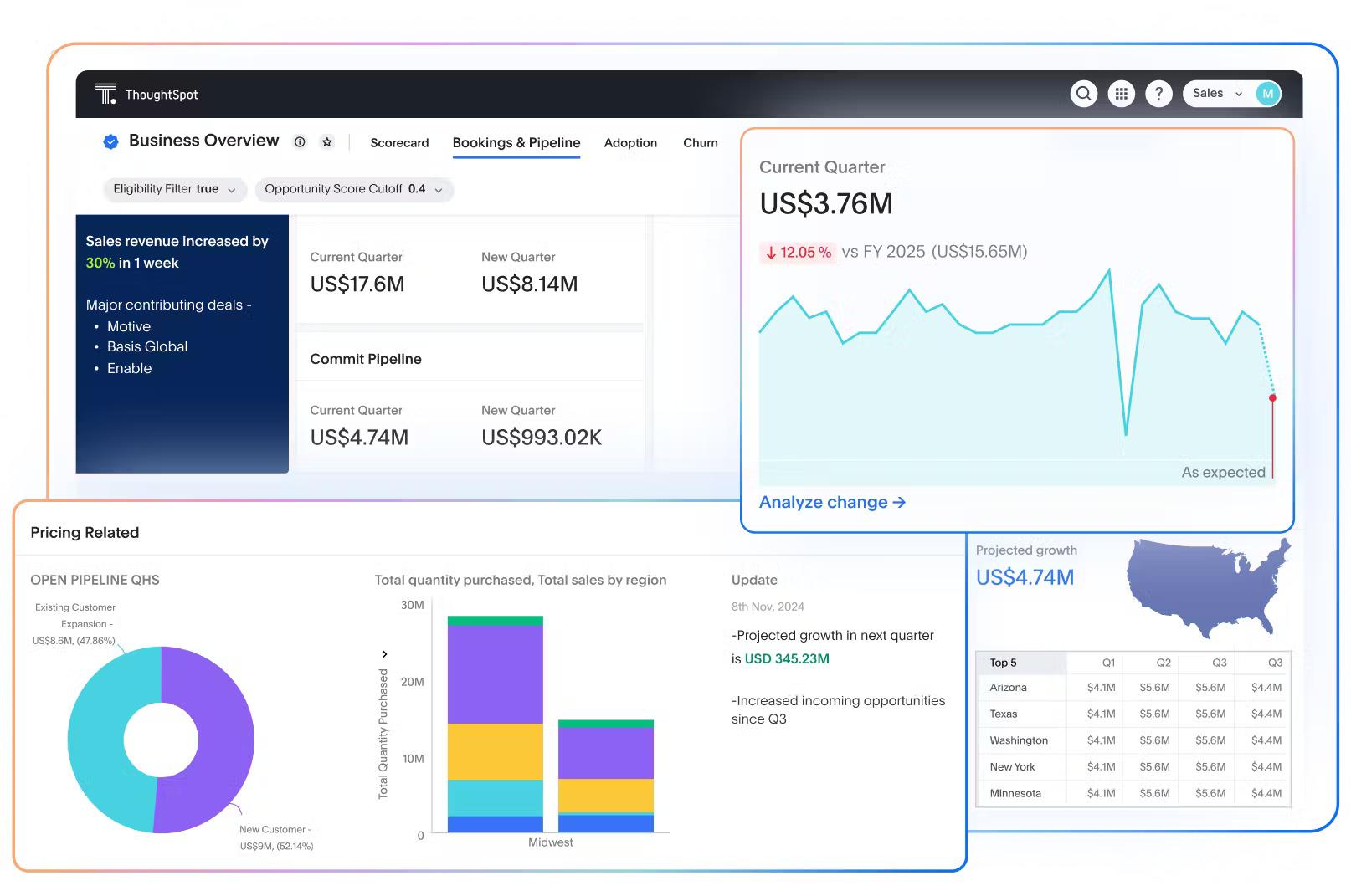
A4: Popular AI-powered platforms include Tableau with AI extensions, Microsoft Power BI’s AI features, Google Data Studio paired with AutoML, and specialized AI visualization tools like ThoughtSpot or DataRobot. These integrate AI capabilities to streamline report generation.
Q5: Is technical expertise required to use AI for data visualization?
A5: Not necessarily. Many AI tools are designed with intuitive interfaces and drag-and-drop features, making them accessible to users without deep coding skills. However, understanding basic data concepts helps in crafting more meaningful reports.
Q6: Can AI personalize visual reports for different audiences?
A6: Absolutely. AI can tailor the complexity and detail of visuals based on the audience, such as summarizing high-level insights for executives or providing detailed analytics for data teams, ensuring the report’s relevance and clarity.
Q7: What are some challenges when using AI for visual reports?
A7: Challenges include data quality issues, AI misinterpreting context, or over-reliance on automated suggestions without critical review. Ensuring clean data and human oversight helps maintain accuracy and trustworthiness.
Q8: How can organizations start integrating AI into their reporting workflows?
A8: Begin by identifying key data sources and reporting needs, then pilot AI tools on small projects to gain familiarity. Training team members and setting clear goals around what insights the visuals should convey will facilitate smoother adoption.
Q9: What’s the future outlook of AI in data visualization?
A9: AI is expected to make visual reporting more interactive, predictive, and embedded within everyday business applications-helping users not just see data but understand and act on it faster than ever before.
This Q&A offers a creative yet clear window into harnessing AI to convert raw data into meaningful visual reports, bridging technical capabilities with practical applications.
The Conclusion
In the ever-evolving landscape of data, AI stands as a powerful ally, transforming raw numbers into vivid stories. By harnessing intelligent tools to craft visual reports, we unlock new dimensions of clarity and insight-making complex information not just accessible, but compelling. As you venture further into this fusion of technology and creativity, remember: the true magic happens when data speaks visually, guiding smarter decisions and inspiring action. Embrace AI as your creative partner, and watch your data come to life like never before.